
")

")


")


")
")
")
 Review")

 Review")
")


Update: Arcturus’ Kickstarter Campaign is now live. Back them here now!
Hi guys, and welcome to another Singaporean watch review! This week, we’re taking a look at the Arcturus’ debut model, the Lion City 1. As you have probably guessed from the model name, Arcturus is indeed, another homegrown watch effort! (I feel so patriotic now) Jokes aside, I hope that this website’s constant coverage of Singaporean brands demonstrates Wah so Shiok’s commitment to shining the spotlight on local endeavors.

The Arcturus will go to Kickstarter for crowdfunding early next month (I’ll update here once the campaign is live), with an initial goal of $40000 SGD. The Lion City 1 (LC1 for short) comes in 3 different variants: sandblasted dial with 24 hour subdial for $399 USD, MOP dial with 24 hour subdial for $499 USD, and finally a MOP dial with sun and moon indicator for $599 USD. There have been a plethora of Kickstarter watch campaigns lately – does the LC1 stand out from the rest? Read on to find out if it’s “shiok” or not!
Arcturus – the Brand
Arcturus is the brainchild of Mr. Alexander Ian Low. Alexander is one of those guys who simply loves to take things apart just to see how they work. His fascination with the technical nitty-gritty of things was probably accentuated by his stint in the army as a weapons technician, in which he stripped and assembled rifles daily. Alexander loved watches ever since his teenage years, and after army he decided to try assembling watches for himself. He initially modded Seiko watches, before eventually progressing to building his own watches from scratch (It was a Parnis dial with Seagull manual winding movement – he still wears it to this day). In fact, that was how Arcturus started as well! Alexander decided to stretch himself by designing his own watch. What started out as a personal project transformed into a commercial one when he uploaded images of initial prototypes to Facebook watch groups. Overwhelmed (and likely a little flattered) by the immensely positive feedback (unsurprisingly, given the beauty of the design – something we will go in-depth with later), Alexander decided to start his own watch label and offer his creation to the masses. Lucky for us!

Arcturus is named after the Arcturus star, which is (according to Google) “the brightest star in the constellation of Boötes, the fourth-brightest in the night sky, and the brightest in the northern celestial hemisphere”. Basically, it’s one damn bright star. Over a nice chat at Starbucks, Alexander revealed to me that that’s what he wanted his brand to be – a shining star in Singaporean watchmaking. He’s very proud to call Singapore his home, to the point that he named his debut model after this tiny red dot. To be frank, his passion for Singaporean watchmaking was infectious, and also further reaffirmed my decision to start Wah so Shiok with local microbrands in mind. Talented individuals like Alexander is why this website exists – so that we can bring attention to the great work that they are doing.
Alright, I’ve blabbered long enough on Alexander and his brand. Let’s delve into the watch itself.
Arcturus Lion City 1 – Build Quality
While the design is really the LC1’s main calling card, make no mistake – this is one well-built watch.

For robustness, the LC1 is equipped with sapphire crystal, and is constructed out of 316L stainless steel. If you have read any of my previous watch reviews (and if you haven’t, what are you waiting for?), you should know by now that a watch with sapphire crystal is virtually scratch-proof. The sapphire comes with inner AR coating as well, so I didn’t have to deal with any of that nasty reflection that I had to on the Advisor Astrohelm (to be fair, the Astrohelm is half the price of the LC1). The sapphire is double-domed as well, serving to magnify the intricate details of its beautiful dial. The exhibition caseback is made of sapphire crystal as well! All in all, an immensely solid case.

At the LC1’s heart is the Miyota 9132 movement. It comes with a date indicator, a 24-hour sub dial, and a power reserve marker. Power reserve is 40 hours, vibration frequency 28800 hz, comprising 26 jewels, and is hacking. For non-watch nerds, what these specs basically mean is that you get a watch with decent power-reserve, and a higher than average beat rate, resulting in a smoother seconds sweep. The Miyota movement is slightly finished as well, making it more visually attractive. It’s interesting to note that by default, the date window on the 9132 movement is at the 3 o’ clock position. Arcturus switched things up a little by placing the date window at the 12 o’clock instead, which involved modifying the stock 9132 movement. Great to see Alexander going out of the box a little – something stemmed perhaps from his watch-modding past, and is an apt reflection of the watchmaker that he is.

The strap is nice too, being a full grain calf leather with crocodile print. Soft, supple and comfortable on the wrist. I’m not a big fan of crocodile print, but in this case it pairs well with the vintage art-deco design of the watch. What’s interesting however is that one of Arcturus’ Kickstarter stretch goal would actually be a complimentary upgrade to genuine alligator leather. That would be awesome – I have not seen a genuine alligator strap on any watch in this price range.

For those lume-heads out there, you would be happy to know that the LC1 comes with lume. The hour markings and watch hands are applied with C1 Superluminova, ensuring good legibility in the dark. I especially like the fact that the 24-hour hand (at 6 o’clock) is lumed too! Arcturus definitely paid attention to even the smallest of details. The LC1 has a water resistance of 100m, so it should withstand pouring rain and the occasional coffee mishap.
Alright, so now we know that the LC1 is a well-built watch, yada yada yada. Truth be told, I sped through the build quality section a bit because the design is where the pot of gold is at. Without further ado, let’s go in-depth into the design of the LC1.
Arcturus Lion City 1 – the Design
I fell in love with the LC1 from the moment I saw it. It is without a doubt the most striking and unique design I’ve seen from a Singapore watch effort thus far. Arcturus states that “The design elements of the LC-1 are reminiscent of the roaring 20’s, at the height of the art-deco era where opulence and grandeur was the reigning design ethos, but simultaneously brings a modern contemporary twist to the table.” Let’s see if this is true!
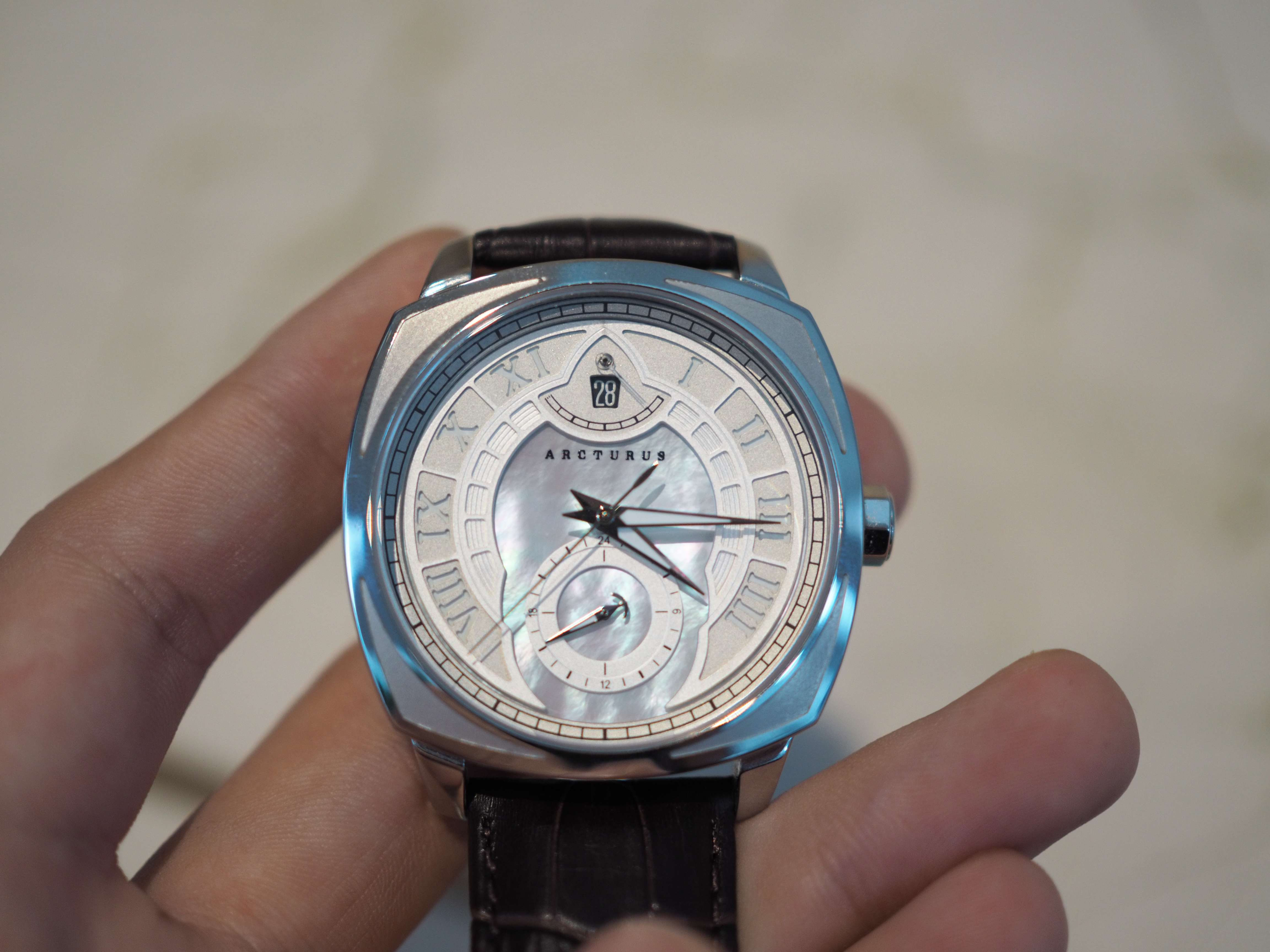
Arcturus knocked it out of the ballpark with the dial. Since we’re talking about “opulence and grandeur”, let’s start with the iridescent mother-of-pearl dial. I love the way it reflects the light. Originally, I wasn’t a fan of MOP dials – I told Alexander that I preferred the black sand-blasted option initially. But after a month with the watch, the LC1 (MOP dial) really won me over. Absolutely beautiful. Secondly, I love the layered dial. The hour markings on the dial are made of separate layers, creating a pseudo-sandwich dial effect. However, instead of a classic 2-layer sandwich dial, there appears to be 3 different layers, with a “cage” being applied around the hour markings. The end result is the creation of something infinitely more elegant than any Panerai I’ve ever seen. Furthermore, thought was paid to the bezel as well. Apparently, the 4 corners of the bezel are shaped like brackets in order to subconsciously pull one’s eyes towards the center of the dial. Basically, it serves to frame the masterpiece! I love the contrast and depth that’s present even on the bezel. The 4 corners are indented, providing depth, and are bead-blasted, providing contrast to the otherwise polished bezel. I love the fact that thought and effort were put into the bezel, which is an area where most microbrands neglect. (Unless it’s a divers of course, and even then…)

In addition, the striking lines of the dauphine hands gives the LC1 a sharp look. I love the fact that the hands are elevated as well – again, it adds depth and complexity to the dial. I adore the choice of the railway minute track too. Usually, we tend to see the railway minute track in vintage inspired watches. (Most notably, the Vacheron Constantine Traditionelle) Arcturus talked about bringing back the feel of the roaring 20s – well, this is a watch that wouldn’t have looked out of place in The Great Gatsby!

As aforementioned, Alexander chose to shift the date window to the 12 o’clock position instead of sticking with the default position at 3 o’clock. The reason for this is preserve the symmetry of the dial. I love the idea of having the power reserve hand made of a transparent polycarbonate, which creates the illusion of an unobstructed date window. A little stroke of genius, this sort of design innovation is exemplifies what I love about the LC1. Furthermore, if you look closely at the power reserve indicator, you would notice that the left end has a sort of jagged line, as compared to the solid line on the right end (when full). The differing markings serves as a juxtaposition between the watch fully-wound and it being in need of a good winding. It’s a minuscule detail, hard to see without a loupe, but again it speaks to the dedication to details that Arcturus prides itself in.
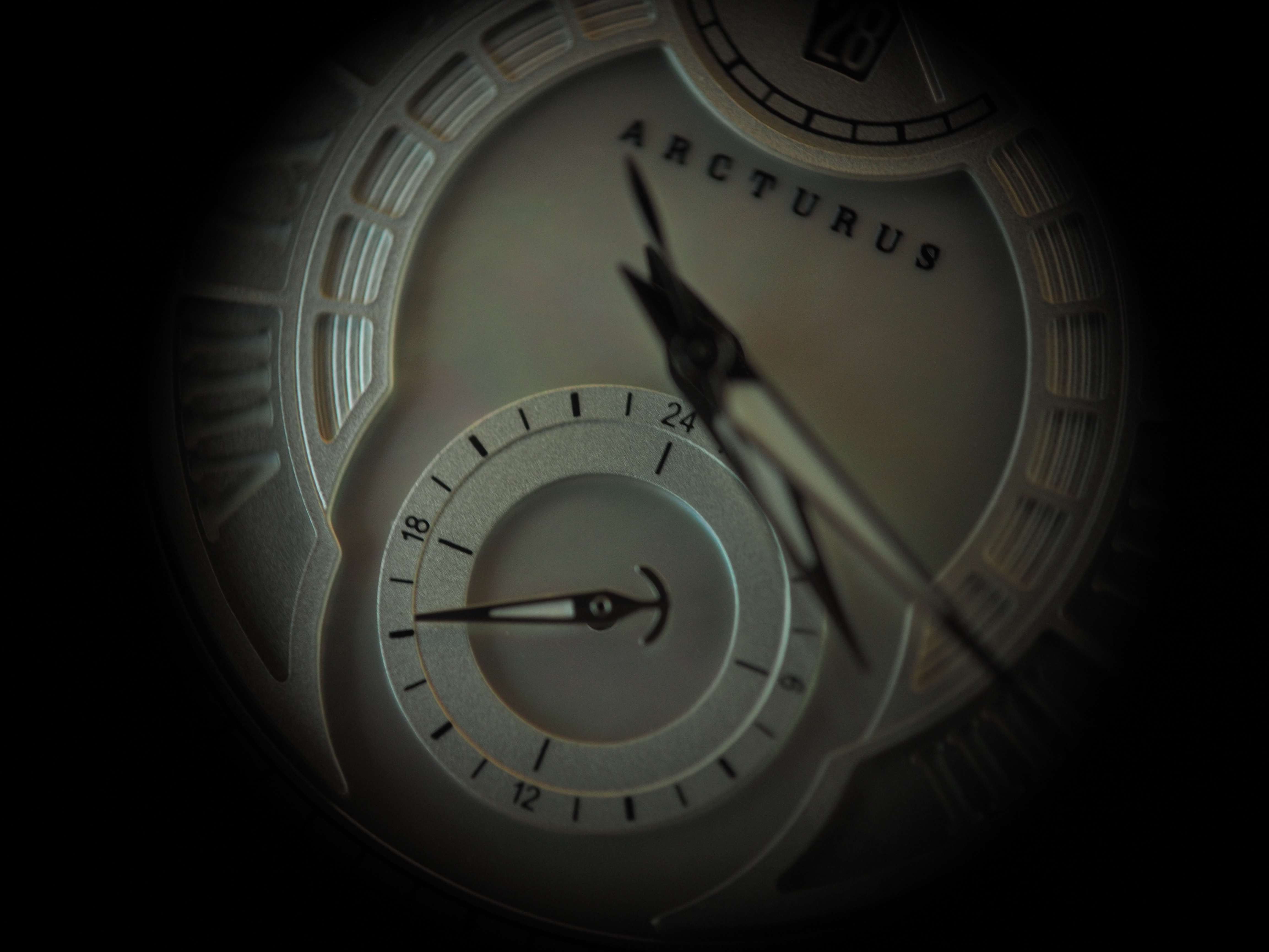
Yes, we are still on the dial. This is probably the most amount of words (and photos) that I’ve spent on a watch’s dial thus far. This speaks to the complexity of the LC1 – there are so many details that I feel are worth mentioning! For the 24 hour sub-dial, I love the dagger-shaped hand. Again, it adds to the bold, sharp look of the watch. In addition, the dial is composed of 2 separate tracks, contributing to the intricate design of the watch. I also like the alternate bolding of lines as it increases legibility. The amount of detail that Arcturus has put into the dial of the LC1 is simply astounding. The more I look, the more details there seem to be!
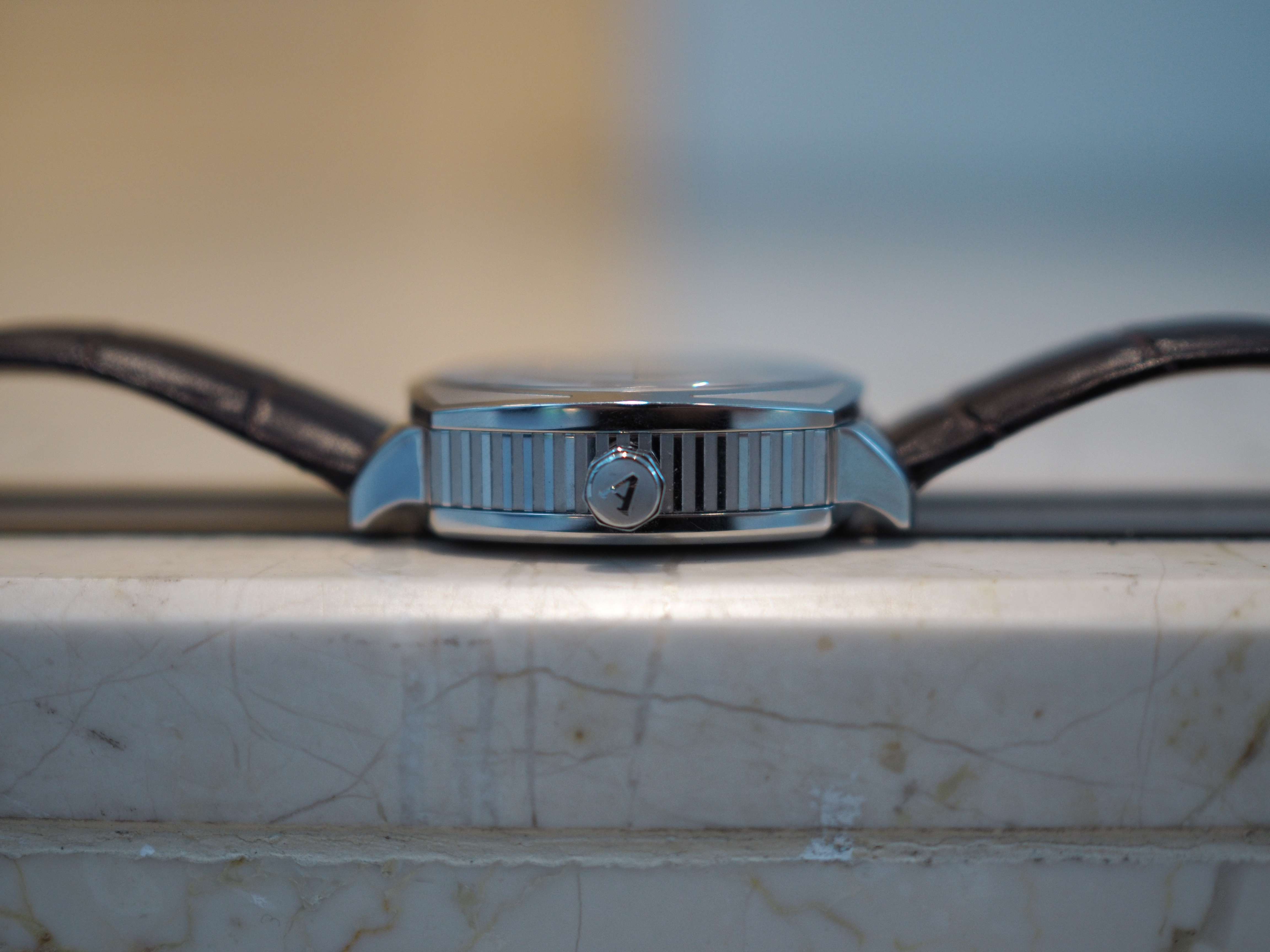
It’s not just the dial that’s stunning. On the side of the case, the alternating finishes of high polished stainless steel and bead-blasted finish creates contrast and the use of strong lines further reinforces the art-deco feel of the watch. In fact, I had other watchmakers tell me that the case sides was the first thing that they noticed about the LC1! Furthermore, we get an embossed crown, done also in alternating polished and bead-blasting finishes. Bold lines, depth and contrast – these seems to be the LC1’s design ethos, and so far Arcturus’ commitment to those have been total.

Finally, the caseback. In keeping with the theme of opulence and grandeur, we get a black enamel finishing. This is certainly something unique that I’ve yet to see in other watches. Singapore is clearly inscribed here too! The rotor is signed as well, in what looks like gold font. The case back of the LC-1 also pays homage to the Helix Bridge, with a section of the patterns adorning the exhibition case back. I’m a bit torn about this. While I get the idea of paying homage to one of Singapore’s most iconic architectural structures, the “helix bridge” patterns obstructs the view of the movement. I’m something of a movement aficionado – I like to see the subtle decorations of the movement, the rotation of the balance wheel, etc. To me, the engineering marvel of the movement is what makes a mechanical watch special. Arcturus, perhaps take a leaf out of your own book and make the “helix bridge” pattern translucent or hollowed-out? Just my two cents.
Overall, the LC1 has the most unusual and striking design of any Singaporean watch effort that I’ve seen to date. I love the attention to detail that Arcturus has clearly put into designing the watch. From the dial to the bezel, to the case sides and case back, it seemed as if Alexander asked himself – how do I make this special? Kudos to you Alexander, for making an exceptional watch.
Arcturus Lion City 1 VS Detroit Watch Company 1701 Series
Given the unique looks of the LC1, it was actually pretty hard for me to find a similar watch to compare it with. Ultimately, I decided on the DWC 1701 series to be its competitor.

The DWC 1701 retails for $845 USD. Spec-wise, the DWC 1701 is identical to the LC1 – both have the Miyota 9132 powering them as well as sapphire crystal with AR coating. In terms of design, they are pretty similar too, with date windows, 24 hour sub-dials, and a power reserve indicator.
I actually quite like the looks of the DWC 1701. There are little design elements that speaks to DWC’s attention to detail. Firstly, I like that the 24 hour sub-dial and the power reserve indicator are recessed. Combined with the applied indices, this creates depth in the dial. Secondly, I adore the red marking of the power reserve indicator (mimicking that of an empty battery bar). Furthermore, they even included the coordinates of Detroit as well at 10 o’clock! (Yes, those are the coordinates of Detroit – I searched it up on Google Earth). Lastly, I think that the hollowed out hands are a nice touch as well. The only thing I don’t like is the blue painted hands. I think they are painted, because they are of too bright a hue to be heat-blued or even electroplated. It just looks cheap (like it came out of a MVMT watch), and out-of-place in a vintage inspired dial.
While the DWC 1701 is nicely designed, the allure of the LC1 is simply undeniable. In terms of design, the LC1 is superior for me. The DWC 1701 has a good-looking dial – but the LC1 has a great dial, case, AND caseback. The luxurious look of the MOP dial, combined with the shift of date window to the top (not to mention making the power reserve hand translucent) propels the LC1 to another stratosphere. The best part? Not only does the LC1 triumph in design, but it wins in value too. At $499 USD (for the MOP variant), the LC1 is almost half the price of the DWC 1701 series. Due to the aforementioned reasons, the LC1 wins this shoot-out.
Conclusion – so the Lion City 1 “shiok” or not?
Definitely. In fact, I would say out of all the watches I’ve reviewed so far, the LC1 is probably my favorite. It is definitely the review piece that I wore the most!

The LC1 is a watch with style and substance in spades. I love the little intricate details that Arcturus has put into this watch – it’s full of bold lines, depth, and contrast. Alexander said that he drew inspiration from iconic watchmakers such as Gerald Genta while conceiving the design of the LC1. Well, it definitely could have passed off as a haute horlogerie piece!

The LC1 starts at $399 USD, going up to $599 USD for the top-end option. Arcturus’ Kickstarter campaign should be go live in the first week of February, so watch out for it then! At these price points, getting the LC1 is really a no-brainer. You’re getting a well-built, superbly intricate (just look at the multiple dial layers in the picture above!) watch for an incredibly reasonable price. Currently, the microbrand world is flooded with divers (pun intended) – it’s great to see Arcturus bringing something absolutely unique (that isn’t an homage” in any respect) to the table. Above all, it’s a distinctive art-deco look – I guarantee that you won’t see many similar designs to the LC1 on the wrists of others! Absolutely blown away by Arcturus’ maiden effort – I hope that Alexander would be able to continue conjuring up such magical timepieces for a long, long time.
P.S If you haven’t already, do follow my social media channels on Facebook here, and on Instagram here! Click on the subscribe button at the top of the website too to receive the latest notifications when an article is out.
P.S.S If you like my content, do consider donating a small sum! After much consternation I’ve decided to remove Google ads from the website so as to give viewers the best reading experience possible. An average review here garners about 1000 views – if everyone just donates a dollar, it would go a long way to maintaining this website! The donation link can be found at the bottom of the website.
Arcturus Lion City 1 Specifications:
• Case: 42mm 316L Stainless Steel, 49mm lug to lug, 13mm at its thickest point (comes in steel and bronze colour offerings)
• Case back: 316L Stainless Steel with black enamel finishing
• Movement: Miyota 9132 with power reserve indicator, 24 hour sub-dial, hand-winding
and hacking seconds
• Glass: Double-domed 4mm sapphire crystal with anti-reflective coating.
• Dial Options: Sandblasted dial with 24 hour hand. Mother of pearl dial with 24 hour
hand. Mother of Pearl dial with Sun & Moon
• Kickstarter prices:-
o Sandblasted dial, 24 hour hand – 399USD
o Mother of Pearl dial, 24 hour hand – 499USD
o Mother of Pearl dial with Sun & Moon – 599USD
Image credits:
Joel Khoo, @keojoloh
Detroit Watch Company
Arcturus Watches

")

")